Static Images
Add Useful Alt Text
Not every image needs alt (alternative) text. But most probably do. Here's a flow chart to help you decide:
1) Decorative Images
Not every image is conveying information. When you go onto any blog on the web, chances are that the author has added a hero image to their blog post. While those images are generally speaking nice to look at they quite often don't actually add any value to the post itself. Take e.g. Kent C. Dodds' website. All of his posts have a nice hero image but those images don't actually add any value to the content of the post. If you left out the image absolutely zero information would be lost.
Images like that don't need an alt text and I'd even argue that those images shouldn't have an alt text at all. But! Don't omit the alt prop completely. Instead set it to alt="". That way you
a) Make sure that when you come back later you know that the omission was intentional and
b) the screen readers also know that this was intentional and don't try to construct some sort of context from the image file name.
When in doubt, always add an alt text though.
2) Functional Images
Sometimes an image is only/mostly decorative but it's 'hiding' important functionality.
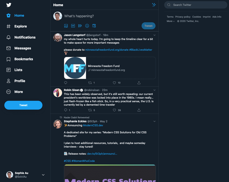
Take for example the Twitter icon on the top left of the twitter page. The icon itself doesn't add too much extra info for the user. It does however represent a link that's gonna take you back to the homepage. What you want to do in this case is set the title attribute on the a (link) element and set the alt-text to "".
Now, imagine yourself explaining the image to a friend who can't see it (which is kinda what a screen reader does). You wouldn't tell them "there's a twitter logo" and then leave it at that. You'd probably say something along the lines of "when you click the twitter logo, it redirects you back to the home page." And that's what you should write into the alt text.
But try to keep it short and be aware of what the screen reader can already infer. A screen reader will e.g. already tell the user that that image is a link so you don't need to specify that on click you're getting redirected. Instead, go with "Back to the home page". Or, to keep it short and sweet "Back to home" or even just "Home".
Always ask yourself: "What does the image do?" Not "What does it look like?"
3) Informative Images
If you've come to the conclusion that your image isn't just purely decorative you now need to think about your alt text. Because just having alt text isn't helpful. It needs to be meaningful as well. Think about "What information/context would the user miss if the image wasn't there?" Use that as the alt text. And refrain from using "image of" or "showing" or anything similar to that since it doesn't add any extra value to the user.
Additional Considerations
Another thing that comes into play when you have images that aren't purely decorative is that those images need to be accessible just like the rest of your website. That means having well-sized text, high contrast and well-contrasting colors amongst others.
🔥 Hot Tip: Make missing alt text visible
When you're developing it can be hard to keep track of where you've set alt text and where it's still missing. One simple way to detect it is by changing the styling of images with missing alt text:
img:not([alt]) {
  filter: blur(5px);
  border: 5px solid red;
}
Animations and Reduced Motion
Animations have always been cool and practically everyone wants them on their landing pages. But to some people these things aren't pretty toys but can actually cause pian raging from nausea to migraine attacks to potentially even seizures. I myself love them (animations) as much as the next person but when I'm in the middle of a migraine attack I will feel the urge to go and murder the poor developer of whatever website with animation I happened to land on.
Luckily, you can help these users by using the prefers-reduced-motion media query. Usually, users will turn on reduced motion in their OS settings which will then be passed on to the browser (well, except IE11 of course). prefers-reduced-motion has two valid values: reduced and no-motion. To catch as many users as possible, you should wrap your animations in a media query, making the non-animated styling the default like so:
.fancy-thing {
  opacity: 0.8;
}

.fancy-thing:focus {
  opacity: 1;
}

@media (prefers-reduced-motion: no-preference) {
  .fancy-thing {
    transition: opacity 500ms;
  }
}
Even when the user hasn't set reduced motion you will want to limit animations to no longer than 5 seconds or make it interruptible. Things that are cool: Fade in animations, animate on hover. Things that are not cool: Animated background image, moving body text.
On SVG
SVG are a special case in that they can act as 'regular' static images but can also be animated. Therefor but the static image and animation rules apply. In most cases you probably want to use an SVG as an image though. To make it accessible, you can use one of two approaches:
<img class="svg-img" role="img" src="/static/image.svg" alt="Alt text here" /><svg role="img" version="1.1" xmlns="http://www.w3.org/2000/svg" xmlns:xlink="http://www.w3.org/1999/xlink" x="0px" y="0px">
<title>alt text here</title>
<!-- content here -->
</svg>Using an img tag is generally speaking a bit faster on render but if you want to dynamically manipulate the image the svg tag is the way to go.

